At a glance
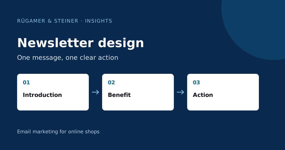
Give each email a clear purpose. In the Normrahmen example, product imagery alone is not enough: benefits and model comparisons help readers decide. The image export explains the structure; readability, links and email-client display also need testing.
The briefing comes before the layout
A product launch, a guide newsletter and a seasonal promotion each serve different purposes. Before designing, make a note of the following: Who is receiving this email? What does the recipient already know? What question are we answering? Where does the most important link lead? This will prevent an attractive layout from being filled with random product tiles.
A useful template is this sentence: ‘This topic is relevant to these recipients right now because …; after reading the email, they can …’. If the reasoning remains vague, narrowing down the topic usually helps. In e-commerce, it should also be established early on which products are available and whether the landing page actually displays the promised selection.
A structure that guides the reader through the message
| Module | Task | Question to check |
|---|---|---|
| Subject line & preview text | Introduce the occasion and value in the inbox. | Does the email deliver on the promise it made? |
| Introduction | Make the topic easy to understand straight away. | Can the message be understood even without a large image? |
| Contents | Explain products, answer questions or provide guidance. | Does each section support the main message? |
| Call to action | Guide the reader to the appropriate next step. | Is it clear before the click what comes next? |
| Footer | Ensure that the sender, contact details and unsubscribe option remain easily accessible. | Is the section legible and are the links intact? |
With a small selection, a single, clearly recognisable focus is often sufficient. If the email features several products, readers should be able to grasp the differences quickly. A long list of similarly weighted content makes it harder to decide. Shorten sections where they merely repeat a point that has already been explained.
Mobile readability and accessible content
Review the email on a narrow screen before approving the desktop design. Check line breaks, text size, spacing and whether links are easy to tap. Product columns need a sensible order on mobile. Promotional terms must remain readable when the layout scales down.
Present key information as real text. Add meaningful alt text to informative images, use clear headings and describe link destinations. Klaviyo specifically recommends building emails with more than images alone. This ensures the content remains comprehensible even when images are not displayed. Contrast and reading order should also be checked.
Also check the dark mode display if this is offered in the email clients used. A transparent logo that works on a white background may disappear against a dark background. The test email as received is crucial; a single editor preview does not cover every possible display.
Design example: Normrahmen split-core current transformers
The following newsletter draft from our Email Design Gallery presents a technical product. For context, we consider the full image export, not just the top section.
View the full Normrahmen concept

- The introduction outlines the selection. The headline names the product family, whilst the subheading specifies the range from 100 to 1,000 amperes. The large product photo illustrates the design. This helps to contextualise the topic before the technical details follow.
- The explanation answers a practical question. The text below the image addresses the option of retrofitting. This is followed by a list of specific features. This provides context for the reader when viewing the product.
- The models can be compared using the same criteria. A table compares three models based on, amongst other things, cable opening and primary current. Anyone still deciding between variants will find criteria to help them choose, rather than three almost identical product images.
- Offer a way to answer outstanding questions. In addition to links to the shop, the lower section lists a telephone number, email address and contact hours. For a product requiring advice, making contact may be the appropriate next step.
The point to check in this draft: The comparison table appears small in the narrow full view. Before sending, check whether the values are legible on a smartphone. A possible alternative would be three model blocks arranged one below the other with the same criteria. It is also not clear from the image whether the table is implemented as accessible HTML text or as a graphic. The test email must reveal this.
The sequence is transferable: introduce the product, explain its use, help readers choose and offer support for questions. This technical table belongs to this particular range; another store might need sizing advice or product guidance.
Pre-send newsletter checklist
- Contents: The subject line, preview text, prices, availability and promotional terms must all be consistent.
- Recipient: Audience, exclusions, language and personalisation have been checked.
- Display: Test emails have been checked on desktop and smartphone, with images off and in the relevant email clients.
- Links: Product pages, main button, contact and unsubscribe links are functional; the landing page continues the offer.
- Measurement: Campaign names and link parameters must be consistent to ensure that subsequent analyses remain comparable.
- Completeness: The end of the email also appears in full in the inbox.
This final check matters for longer templates: Gmail can clip long emails. Klaviyo explains the relationship between HTML size and clipping. Many nested blocks and carried-over formatting can unnecessarily increase the size of the code. You should therefore check the actual test mailing after final editing.
After sending, evaluate the content and design together. A new button colour does not automatically explain a difference in results if the offer and recipient segment were changed at the same time. The email marketing metrics guide helps to select suitable benchmarks.
Sources and further documentation
Product documentation and primary sources relating to the steps described. Editorial source date: 10 September 2026.